

.gif)
Overview
Quick Peek at a Glance
Check Vehicle Records started with a simple goal: making vehicle history easy to understand. Instead of sifting through overwhelming, data-heavy reports, you get a clear, intuitive summary that actually helps with big decisions. Whether you're buying a used car or just checking up on one, Check Vehicle Records make it easy to uncover a car’s story—from MOT records to mileage history—so you can move forward with confidence.
My Role
- UX Designer
- UI Designer
Deliverables
- WordPress Site Design
- Competitor Research
- User Flows
- Wireframes
Timeline
- Jan 2025 - Feb 2025
The Challenge - Balancing Speed, Usability, and Scalability
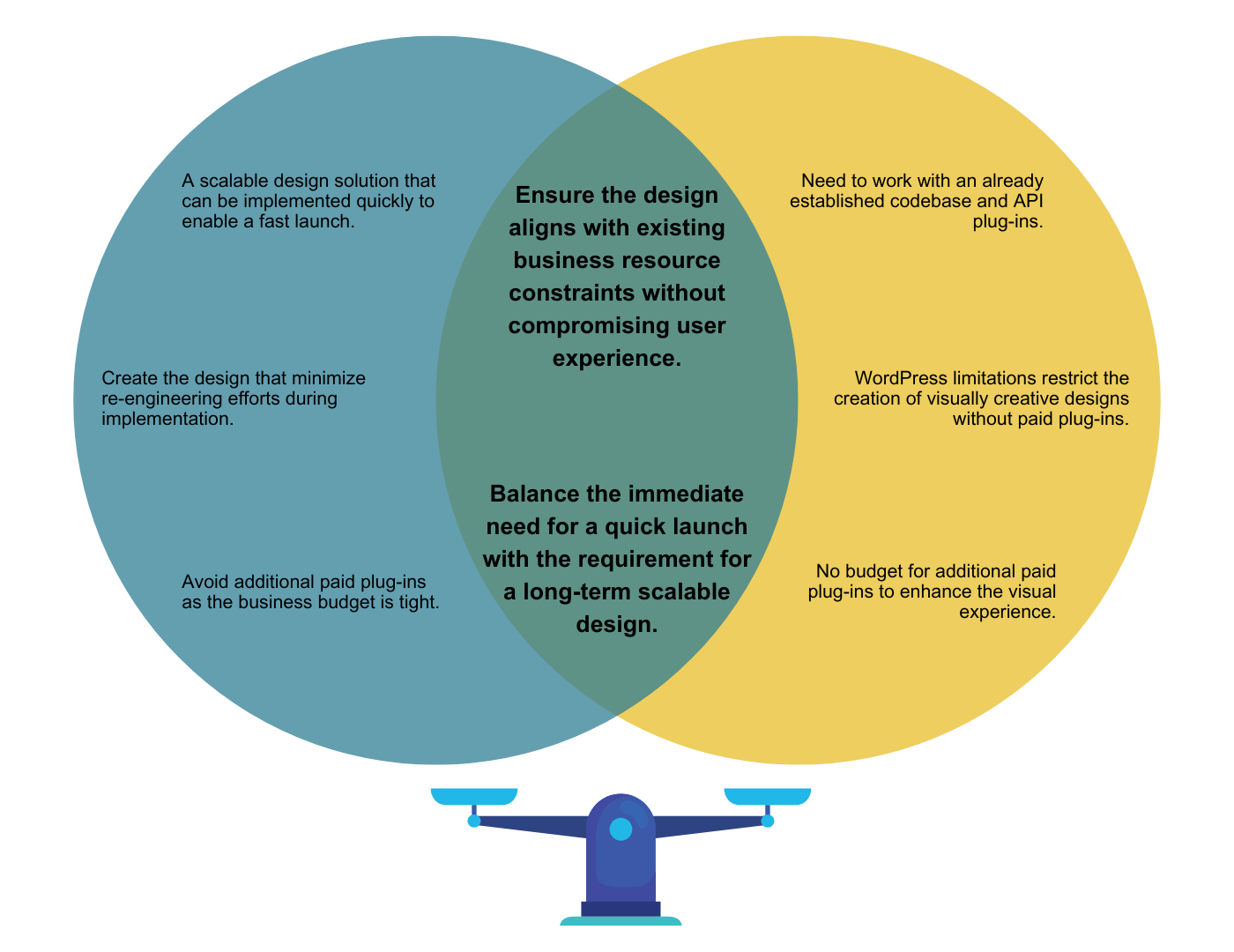
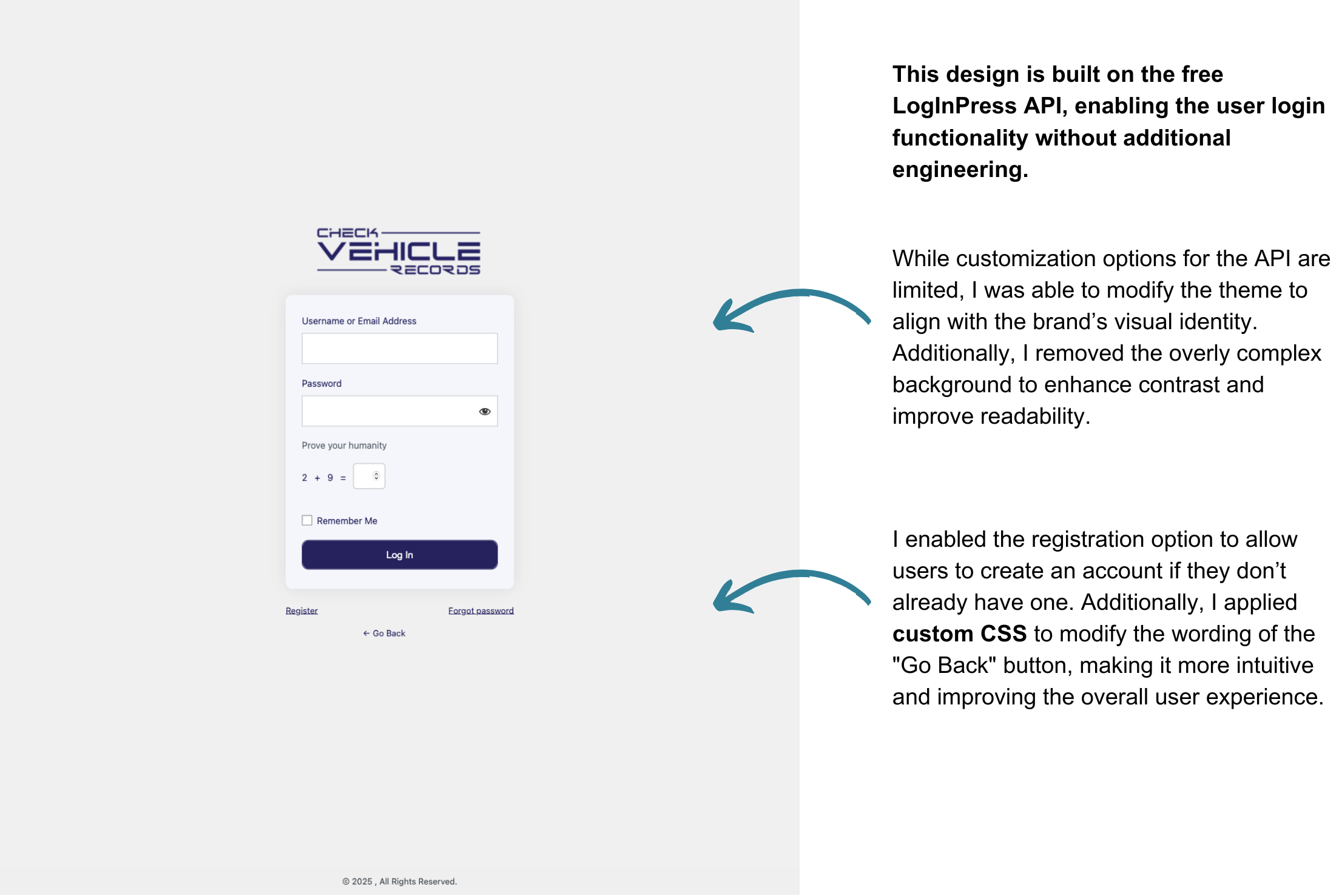
The site is built on WordPress, with a back-end API plug-in already in place—meaning the design needs to work within the existing system without disrupting its logic. While some re-engineering will be needed after the design is finalized, understanding how the API functions is key, ensuring that the design not only integrates smoothly but, to minimizes redevelopment efforts. While the short-term goal is to launch as soon as possible, the business may consider moving away from WordPress in the long run. This makes it important to design with flexibility in mind, ensuring that future transitions can be done with minimal disruption. The priority is a fast, cost-effective, user-centric solution that allows for a quick launch while ensuring scalability for future growth and updates.
- A scalable design solution that can be implemented quickly to enable a fast launch.
- Create the design that minimize re-engineering efforts during implementation.
- Avoid additional paid plug-ins as the business budget is tight.
- Need to work with an already established codebase and API plug-ins.
- WordPress limitations restrict the creation of visually creative designs without paid plug-ins.
- No budget for additional paid plug-ins to enhance the visual experience.
The Way Forward - Finding the Right Trade-off
Given WordPress’s design constraints, I initially considered designing in Figma to maximize flexibility. However, after careful evaluation, I determined that WordPress best meets the business’s immediate needs. Here are the workarounds I implemented to overcome its limitations and ensure a seamless user experience:
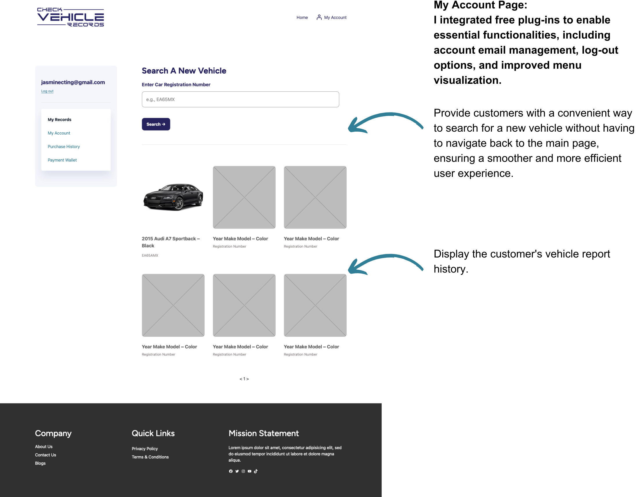
- Rather than letting WordPress’s limitations hinder the user experience, I adopted a strategic approach by leveraging free plug-ins to enhance functionality while maintaining cost efficiency.
- By adapting the design to work with existing APIs such as WooCommerce and LogInPress, I aimed to minimize re-engineering efforts, ensuring seamless integration and a more efficient development process.
- Through research, I discovered a Figma plug-in that converts WordPress designs into Figma, which could significantly streamline future design migration away from WordPress if needed.

VS.
- Highly flexible, enabling rich visual and interactive experiences to enhance user engagement.
- More scalable in a long run, if the business decides to move away from WordPress in the future.
- Higher cost, as full development effort is needed to translate designs into WordPress.
- Slower launch process, since it requires full development before implementation.
- Faster deployment, since it eliminates the need to translate a full design from Figma.
- Cost-effective, as it is a fully functional website-building tool that requires less engineering effort.
- Less design flexibility, relying on paid plugin dependencies for advanced customization.
- Less scalable, when it needs to migrate away from WordPress.
Research
Identify the Current Flaw
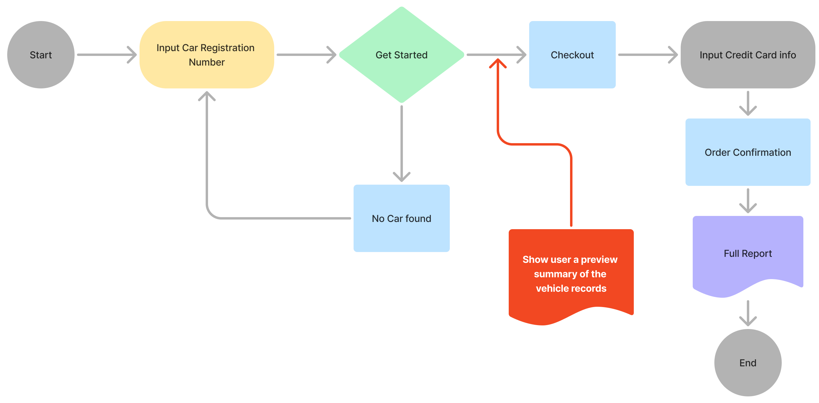
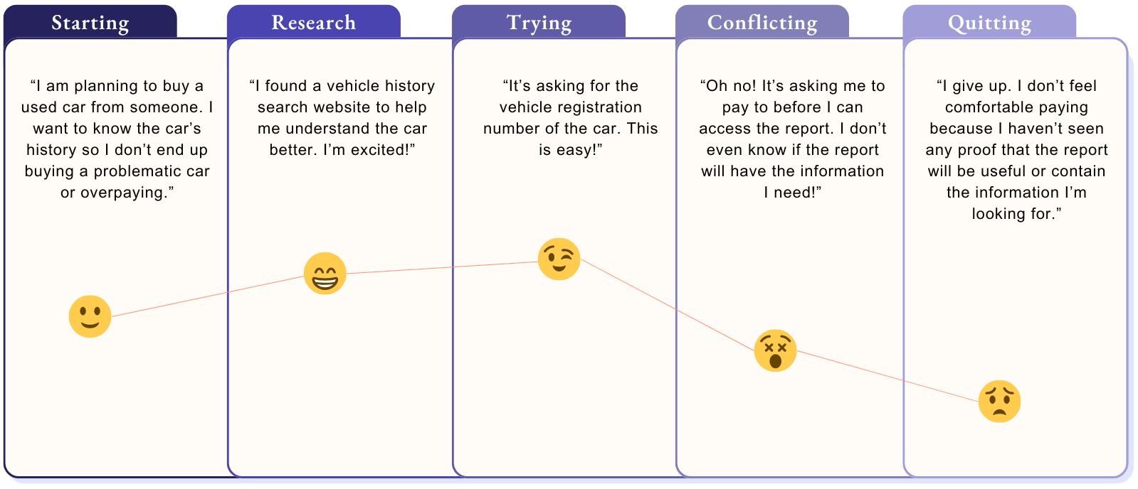
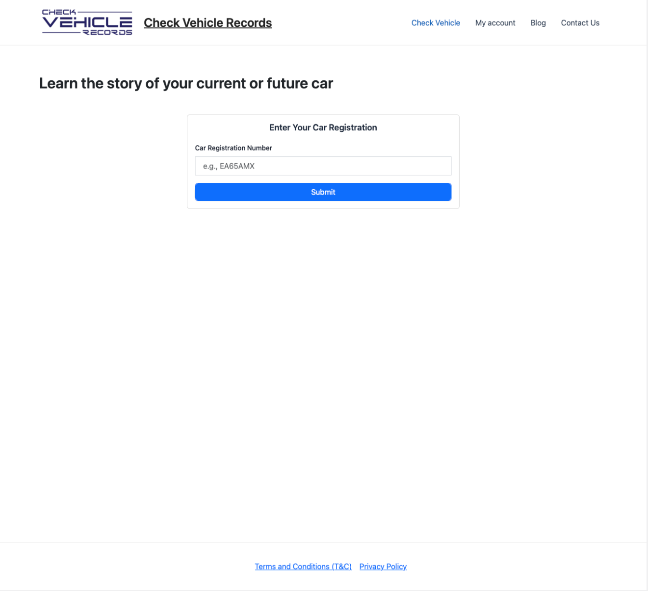
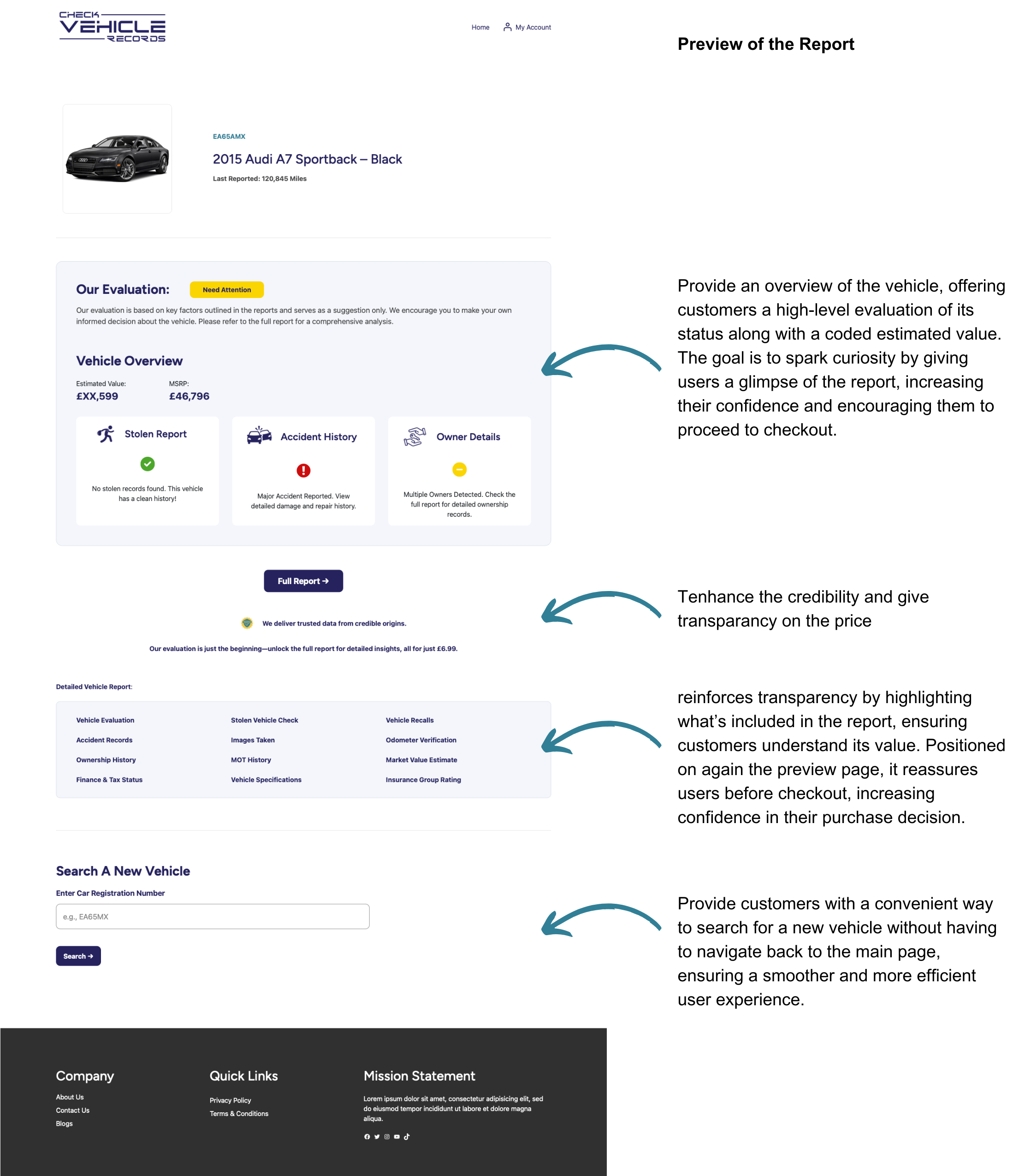
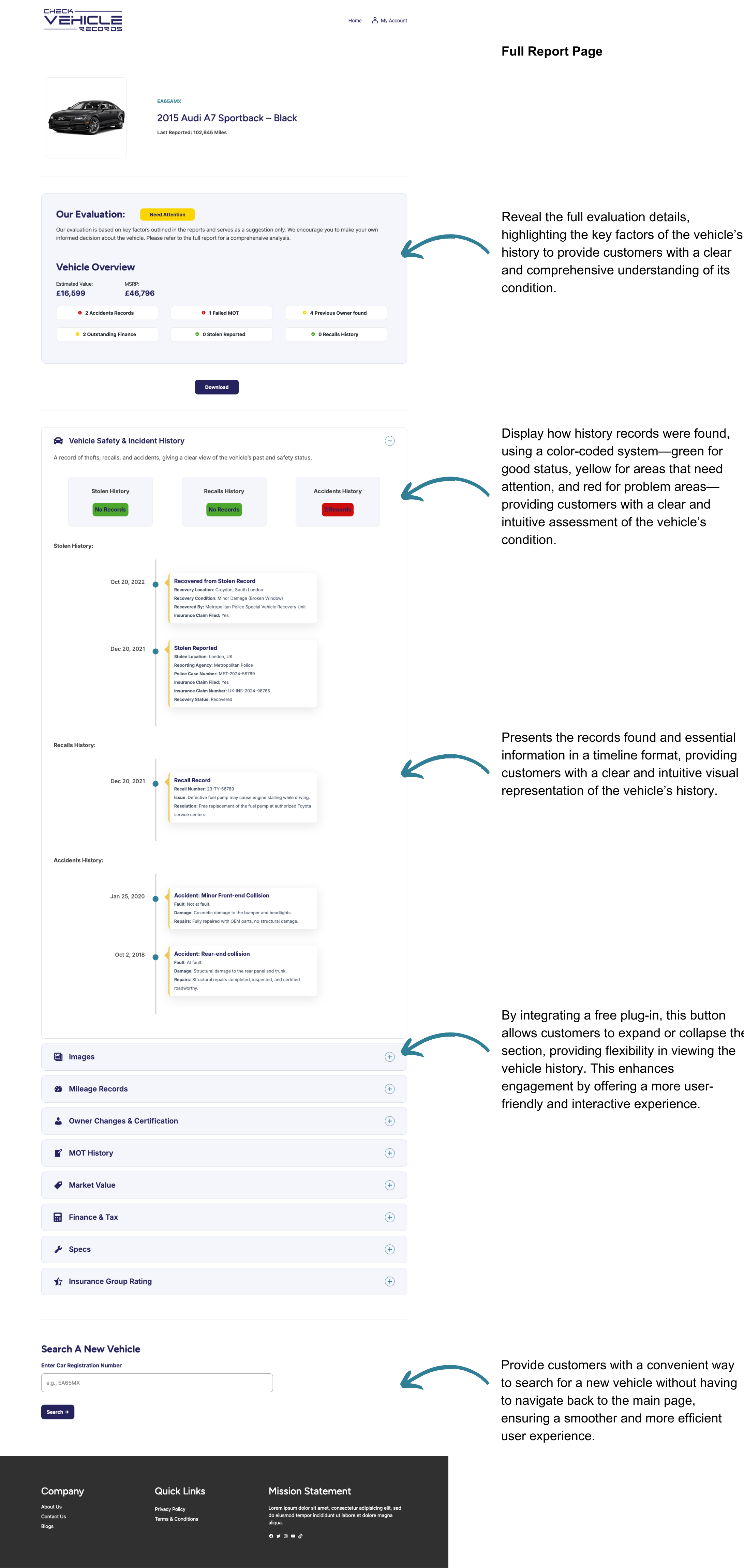
When reviewing the current website, it became clear that the current website lacks a strong design foundation, with minimal effort applied to the visual and user experience aspects. While there’s a clear opportunity to enhance the aesthetics, a more pressing issue stood out—a critical gap in the main user flow. Users are directed straight to the payment page without seeing any preview of their vehicle data after entering the registration number. This missing step likely creates hesitation and uncertainty, as users are asked to make a purchase without fully understanding what they’re paying for. Without clarity and reassurance, they are more likely to abandon the process altogether. Addressing this isn’t just about improving the site’s appearance—it’s about creating a more seamless and intuitive experience that builds trust and encourages conversions.
Gain Insights From the Competitors
I conducted a competitor analysis of 4 key platforms to gain insights into how landing pages, user experiences, and report visualizations are designed and tailored. While these platforms share similarities in user experience patterns, I discovered the critical gap in user flow is also missing across all of them. This same gap is also present in the current Check Vehicle Records website, highlighting an opportunity to improve the user journey and differentiate the platform.


- Competitor websites feature well-designed landing pages with detailed content, establishing trust and credibility with users.
- Vehicle reports are presented with clear and intuitive visualizations, making complex vehicle data easy to interpret and understand.
- Users are guided directly to the payment page after entering the vehicle information, without being shown any preview of the report, which may lead to discomfort and lower conversion rates.
My Hypothesis
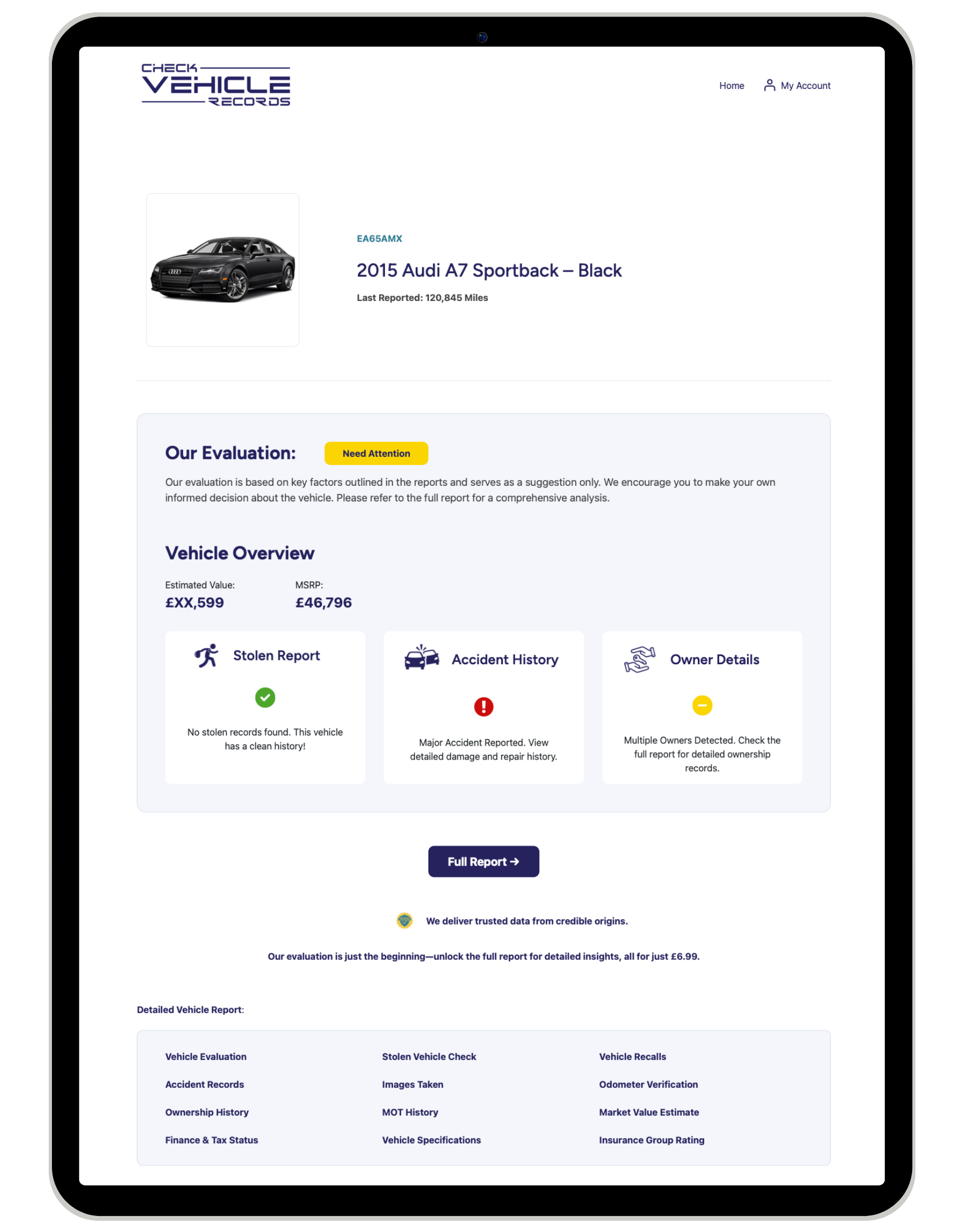
Since users are directed straight to the payment page without first seeing a preview of their vehicle data, they are likely to experience hesitation and uncertainty. Being asked to make a purchase without understanding the value of the report may lead to drop-offs. I hypothesize that introducing a preview page with key data highlights will build user trust, provide clarity, and reduce hesitation—ultimately leading to a higher conversion rate.
Validating the Hypothesis - The Desk Research
To support my hypothesis, I conducted desk research to better understand customer behavior. While direct data on the impact of previewing vehicle reports on conversion rates was unavailable, I found few related studies that align with the concept. These findings highlight how offering a preview or partial access to digital products can build trust, reduce hesitation, and drive higher conversions.
Conclusion: The research supports the idea that providing a preview of the vehicle history report before payment can enhance user engagement and increase conversion rates for the Check Vehicle Records site. By offering users a glimpse of key data upfront, the platform can build trust, reduce hesitation, and create a more seamless and transparent purchasing experience. Implementing this feature presents a valuable opportunity to improve the user journey and differentiate the site from competitors.
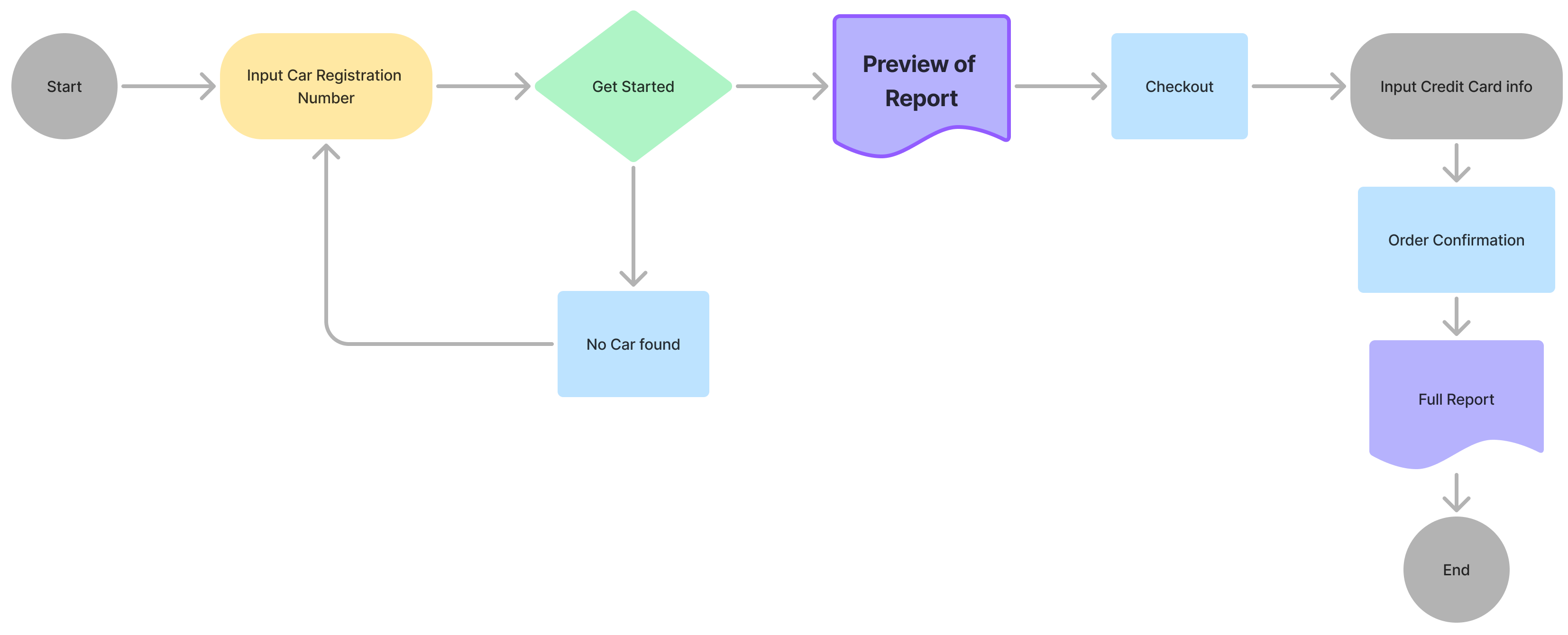
Visualizing the Hypothesis – The User Journey
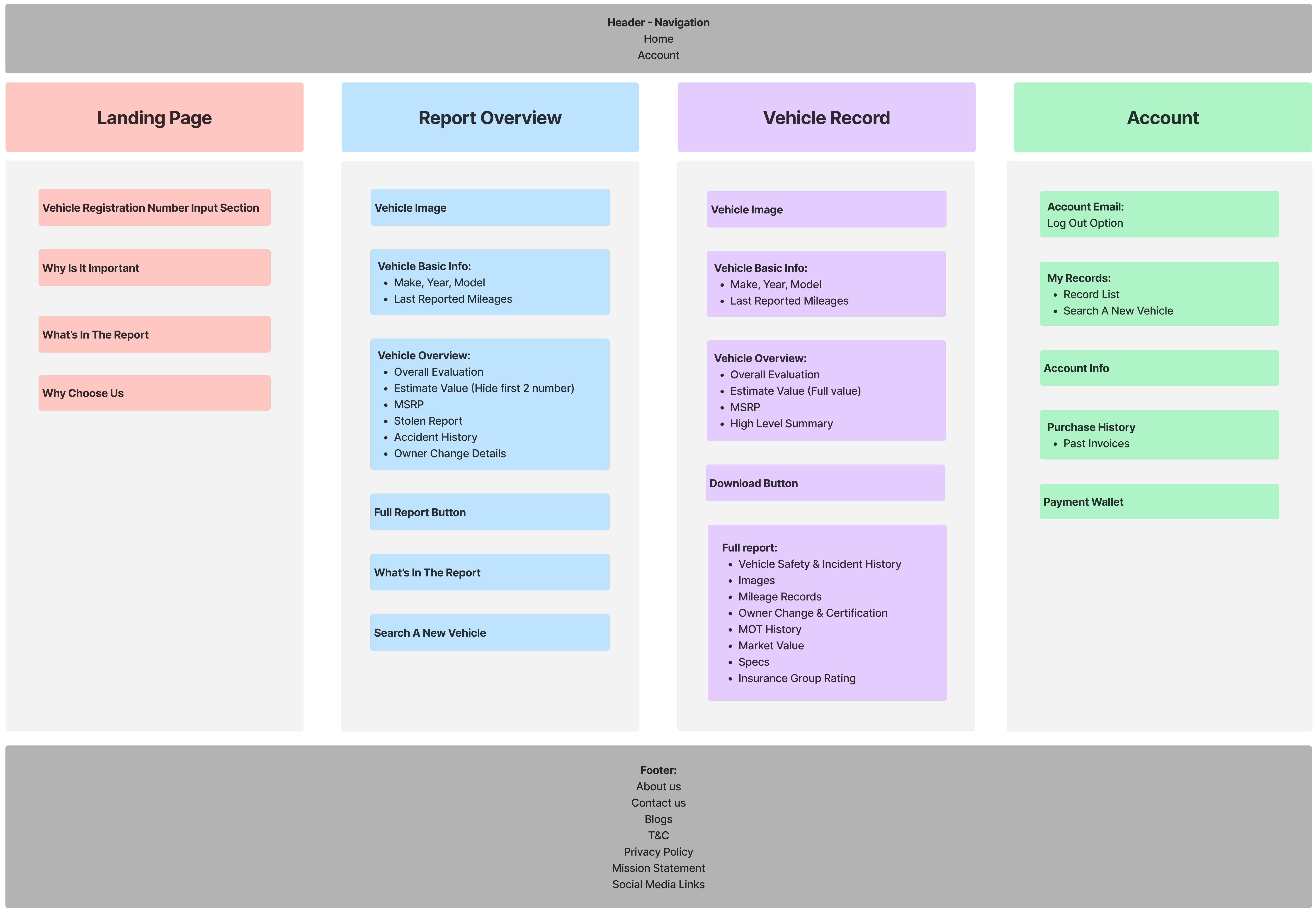
Site Map
User Flow
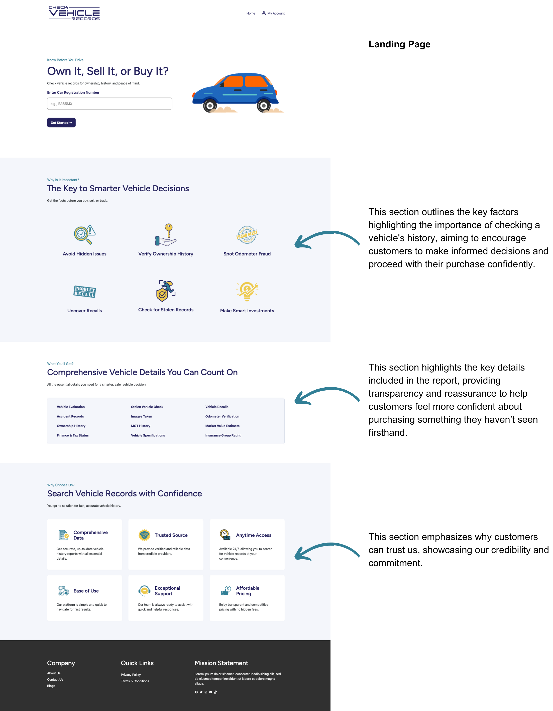
Building on the conclusion from the hypothesis, the solution is to introduce a preview report page before the checkout process.
Site Map
Before implementing the design, I created a site map to establish a clear structure for the platform. The content within the site map reflects key takeaways from the research, incorporating best practices and successful elements identified during competitor analysis.
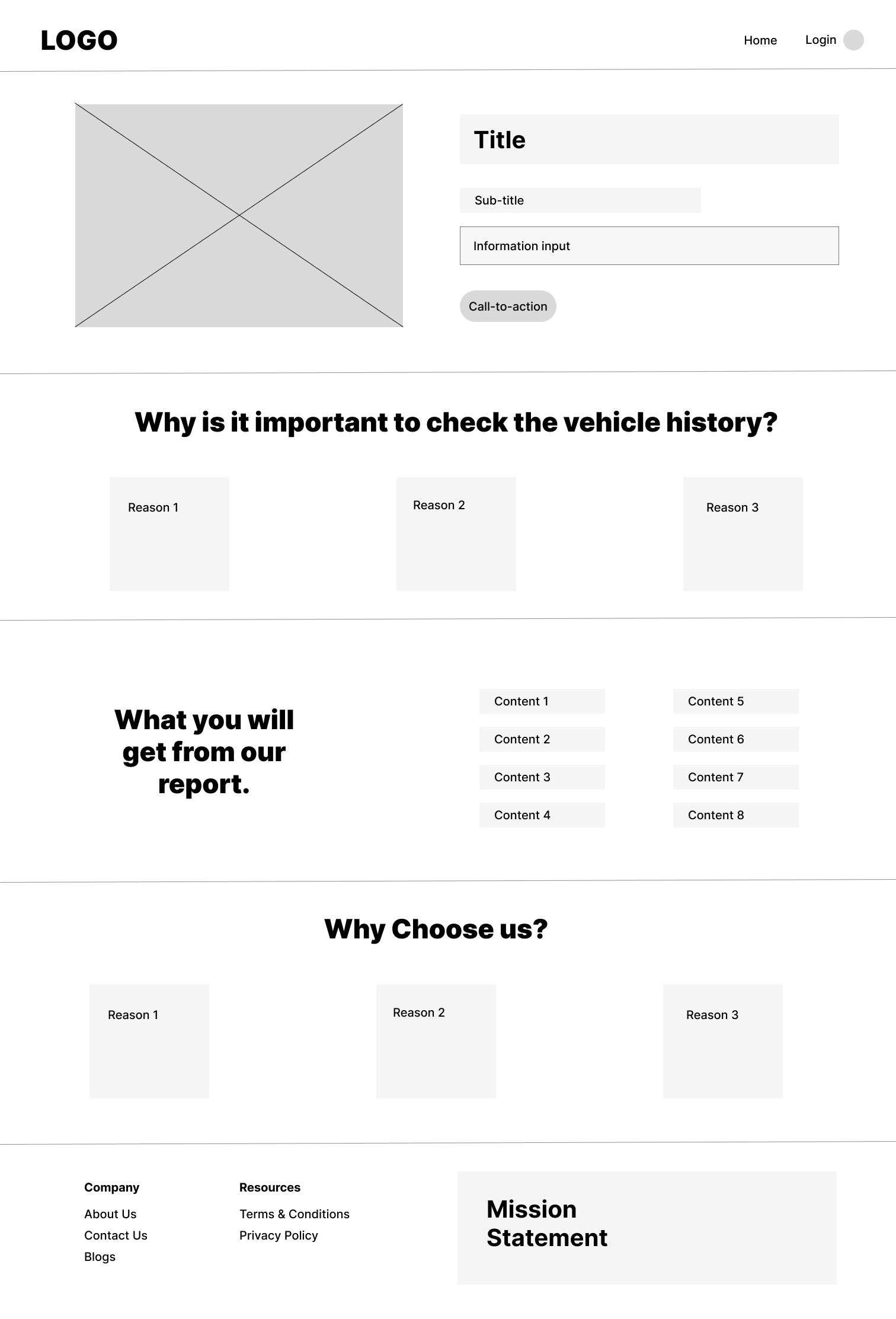
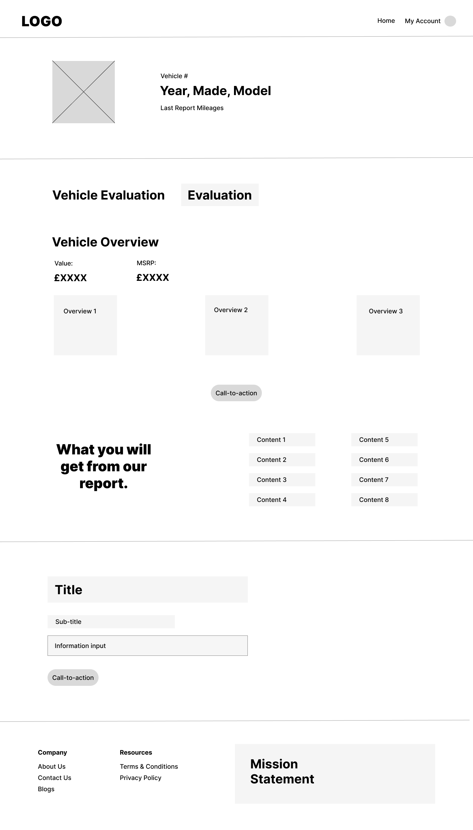
Design
Drafting the Design


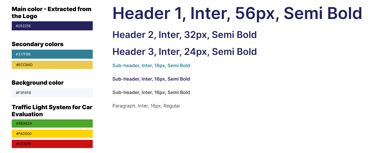
From Fonts to Colors: The Style Guide
After analyzing competitor websites, I noticed that many favor blue and yellow as their primary colors. To align with industry trends while maintaining brand identity, I established the brand theme using these widely recognized colors. Additionally, I incorporated the dark purple from the logo as a central theme to create a cohesive and distinctive visual identity for the website.
Cost-Effective WordPress Solution
Reflections
The Numbers Behind the Screens


What I Learned...
- Aligning Design Decisions with Business Goals: Understanding short-term and long-term goals is crucial for strategic decision-making. Designing solutions that address immediate needs while laying the foundation for long-term success ensures both efficiency and scalability.
- Strategic Research for Effective Design: Beyond user research, exploring technical and business factors is key to making informed decisions. Investigating backend API integrations and evaluating paid plugins helped create a cost-effective, scalable design approach that aligned with business goals.
- Critical Thinking in Competitive Analysis: Competitive analysis goes beyond replicating what others are doing. Identifying gaps in the industry and validating hypotheses with research leads to innovative, differentiated solutions that provide real value.
Vision
My Vision for Future Opportunities & Growth
My work on this project may be complete, but great product is never truly finished. As the product takes its next steps, I see exciting opportunities for future enhancements that could further refine the user experience, expand functionality, and drive long-term growth.
- Optimizing Data Visualization: Improve how data is presented, ensuring clarity and usability, especially in preparation for a transition away from WordPress.
- Enhancing the User Experience: Gather and incorporate real customer feedback to optimize usability improve overall satisfaction.
- Implementing a Credit System: Develop a system that allows customers to pre-purchase credits in bundles, making transactions more seamless and flexible.
- Introducing a B2B Subscription Model: Expand market potential by offering a tailored subscription plan designed specifically for business customers.